Competitive and landslide presidential elections 1992-2016
This series of maps visualizes the levels of polarization, as well as vote homogeneity between different counties across the previous 7 presidential elections. A “0” score equates to a country perfectly divided between the two major parties, and a “1” to a country where every vote is cut for one party.
The maps in concert with one another reveal how polarization between different regions of the country has intensified, as the reds become deeper over the course of 1992 to 2016: particularly in certain areas such as the Great Plains, the Deep South and in the Rocky Mountains. Over these 7 elections, communities in these counties now vote as more of a homogenous block than they did previously, and the likelihood of voters living alongside those who opted for the opposing party is significantly smaller than it was in 1992.
This potential ‘self-sorting’ of voters aligns with existing research on the desire for liberals and conservatives to avoid exposure to one another’s opinions. This is not due to a lack of information about the other side’s beliefs, but a desire to avoid any potential cognitive dissonance.
This distance has potentially exacerbated existing divisions. Pew Research’s 2016 report on partisanship and political animosity showed hostile feelings towards the opposing party to have grown significantly since 1992, with more Americans than ever viewing either Democrats or Republicans as a threat to the nations wellbeing.
Other theories abound for why this has occurred; the range from a self-sorting of the political parties into distinct liberal and conservative movements, to partisan media that separates Americans into opposing spheres of information. The geographic self-sorting and political homogeneity many Americans now live with can certainly be added as a potential cause of the rapidly polarizing American electorate.
These further maps outline the development of politically homogenous and heterogenous communities over the past 5 Presidential elections. A ‘0’ county, which appears without color, is a county that has an identical vote split between the two major parties from the previous election. Greener counties show where votes have become more competitive (more politically heterogeneous) where as redder countries are those that became less competitive (more politically homogeneous) since the last election.
This variation of the data also supports the theory that Americans have become more politically homogenous over the course of the past several elections. There are some anomalies, such as Utah in 2016 (which went from the most Republican state in the nation to being unusually competitive). But broadly it reveals similar findings - that most Americans live in counties which went overwhelmingly for one candidate over the other, as opposed to earlier elections when the vote was more equitable.
Communication and Democracy in Conflict Zones
The 23 states displayed in this interactive map are all classified as experiencing either a war or limited war by the Heidelberg Institute for International Conflict Research. By placing your cursor over each country, users can view the communication level and the extent of Democratic development in each country, as categorized by the Economist's Intelligence Unit.

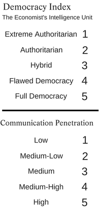
This metric considers both the cell phone and internet penetration level of a nation - that is what percentage of its population has regular access to these ICT technologies. As the map shows, this varies significantly across different conflict-fragile states, with Saudi Arabia's high-income economy providing its population with broad access to ICT. The Central African Republic lies at the other end of the spectrum, with minimal internet and cell phone availability.
Research differs on whether these tools could be a causal factor when it comes to conflict in the developing world. Data from Myanmar suggests greater availability of cell phones has dampened the potential for violent conflict between ethnic groups. In contrast, work on collective violent action in Africa showed the availability of ICT to establish more fertile condictions for inter-ethnic violence.
It also remains possible that the presence of ICT has resulted in higher reportage of violent incidents, as opposed to the ICT itself being a causal factor.
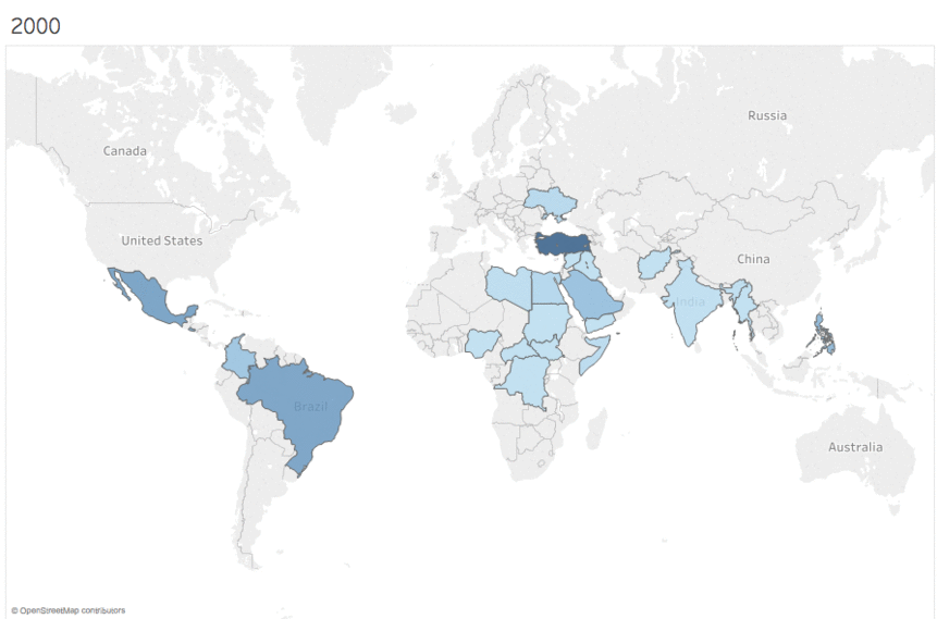
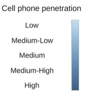
Cell Phone penetration in conflict zones 2000-2016
This visual tool displays the trajectory of cell phone penetration from 2000 up until 2016 for states that are currently engaged in either a limited or expansive war.